HUELLA URBANA | BRAND REFRESH
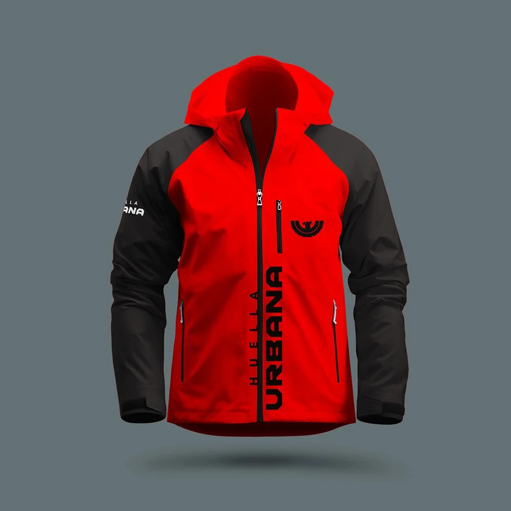
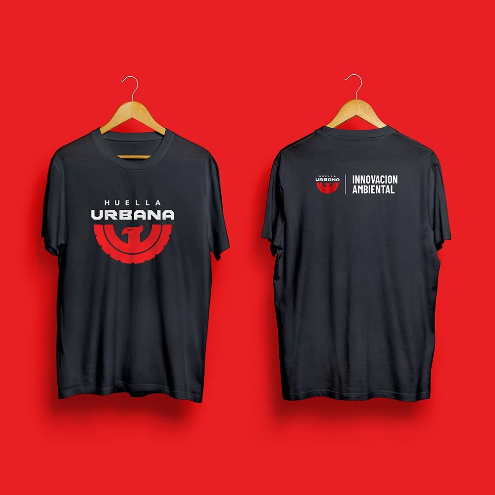
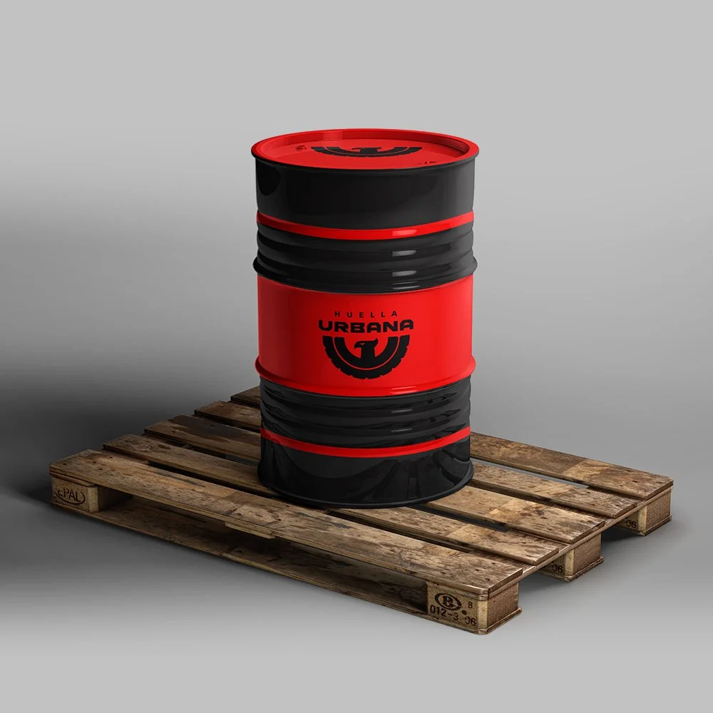
For 15 years, Huella Urbana has transformed recycled tires into premium tiles and sustainable flooring solutions for every kind of space. To mark the milestone, they came to me with a fun challenge: create a brand refresh bold enough to break away from the category. Together, we reimagined the brand with a sharper, more elevated identity, positioning Huella Urbana as a Latin American leader in environmental innovation, with a look that feels modern, premium, and impossible to ignore.
THE CONCEPT: THE REBIRTH
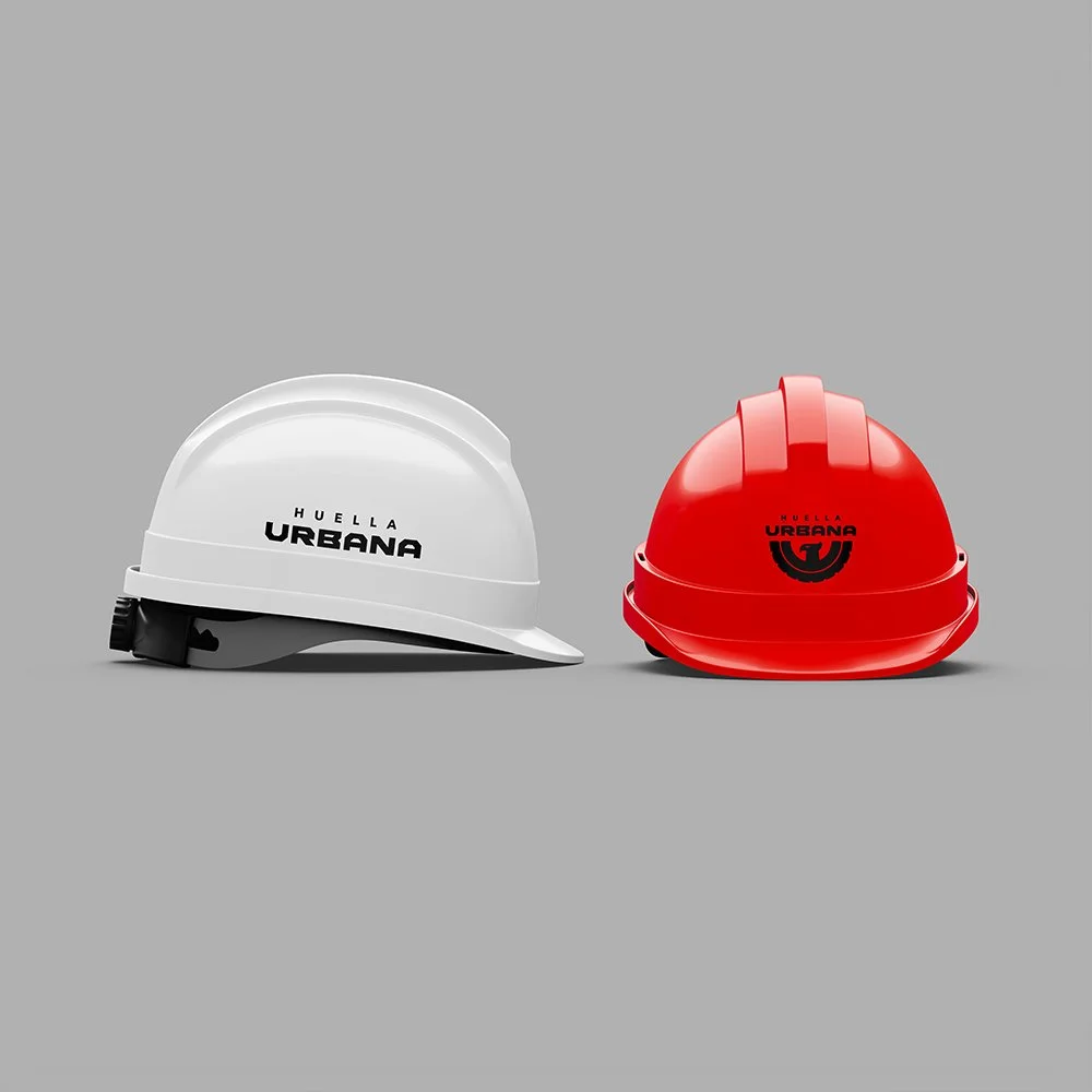
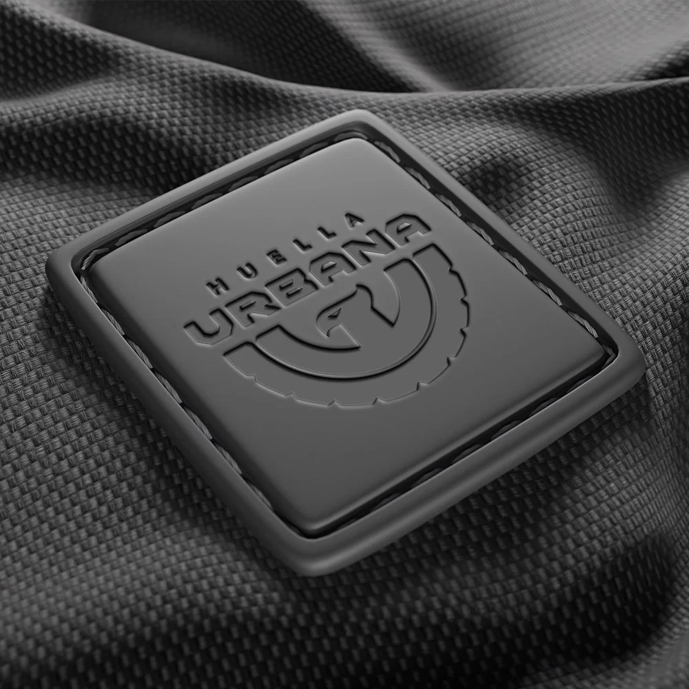
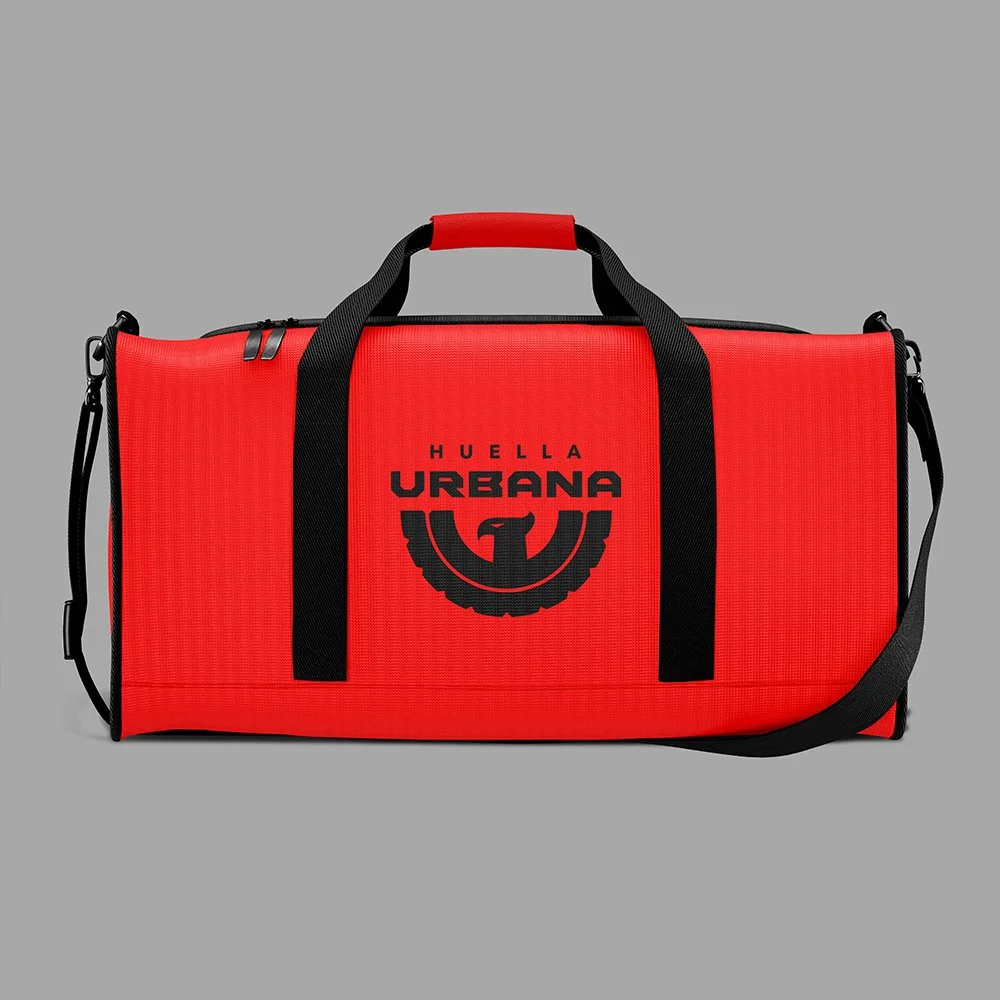
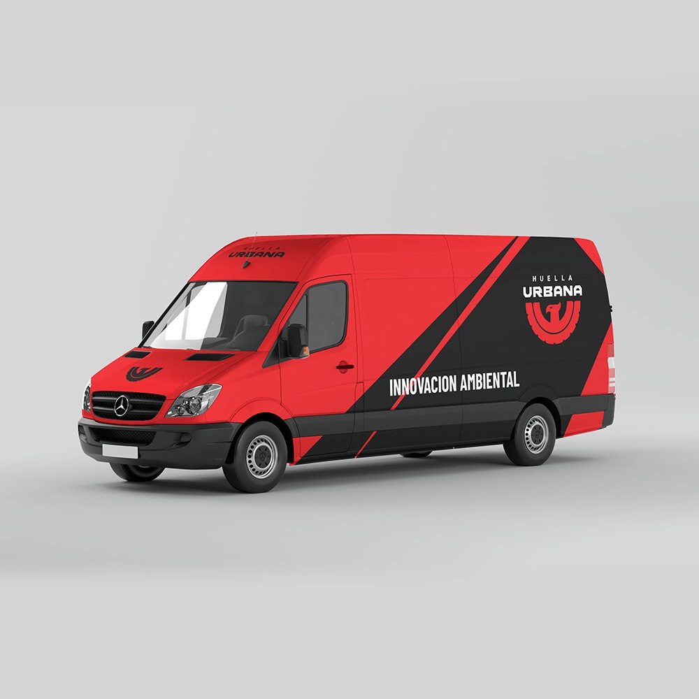
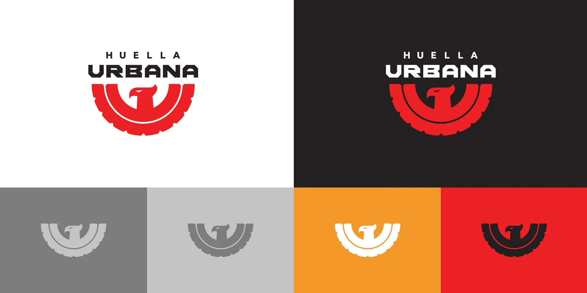
This logo is inspired by the legend of the Phoenix, a universal symbol of rebirth and hope. The central image of the bird, combined with visual elements that evoke a tire, represents the transformation and new purpose given to recycled rubber in our products. Warm colors such as red and orange symbolize the heat that creates new life, while dark gray refers to the original material, tire rubber. This logo encapsulates the essence of giving new life to materials that would otherwise be discarded, aligning with our commitment to sustainability and renewal.
THE ICON JOURNEY
This composition is born after combining the following elements:
1) A tire. 2) The phoenix bird. 3) The letter “U”